I recently had the pleasure of taking one of Edward Tufte‘s seminars, “Presenting Data and Information”. He’s a professor emeritus of statistics, political science, and computer science at Yale, and the author of an important set of books on charting: “The Visual Display of Quantitative Information” (catchy title) (1983), “Envisioning Information” (1990), “Visual Explanations” (1997), and “Beautiful Evidence” (2006).
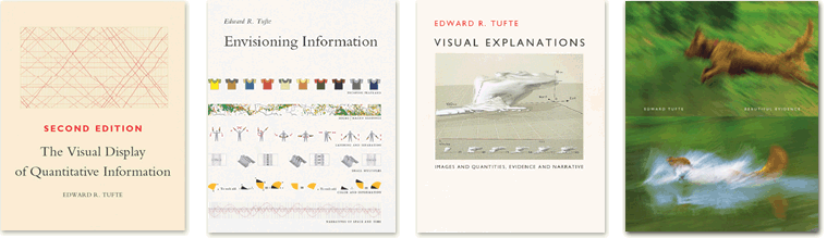
Seminar textbooks, but at no extra charge
He published these himself, and gave them out at the seminar. Not only are they full of good and bad examples of how to present things, but they themselves are samples of what he is talking about in terms of being beautifully laid out, clear, and honest.
The last point is what makes him something of a cult figure. There were hundreds of people at this seminar, and he gives dozens of them every year. That’s far less than the turnout at, say, Tony Robbins cult sessions, but it’s pretty good for a retired professor.
The interest in him comes, I think, from his insistence that there is a moral quality to how one presents things.